
A supply chain KPIs dashboard has to show service (OTIF), inventory turnover, cost per shipment, order accuracy and carrier performance in one place, and the first move is a balanced scorecard plus a single operational view for the team that has to act. Benchmark OTIF against the reported median of 90%, and align the rest to SCOR. That is how we build them at The 3PL Cowboy.
TL;DR:
- Match reporting cadence to decision speed: monitor late shipments and dock status by shift or in real time, review OTIF daily, and assess costs weekly.
- Pair OTIF with fill rate: falling OTIF alongside stable fill rate points to transport or dock scheduling, while declining fill rate calls for checking forecasts and replenishment.
- Benchmark OTIF against the reported median of 90%, but compare only with similar peers and standardize definitions, such as requested versus promised delivery dates.
- Choose Excel for a quick minimum viable dashboard when IT access is limited; switch to Power BI when you need scheduled refresh, wider access, or real time alerts.
- Do not trust KPI results until IDs and timestamps align across ERP, WMS, and TMS; validate formulas against one site and a handful of SKUs before rollout.
Table of Contents
- Which supply chain KPIs deserve a spot on your dashboard?
- How should you design the dashboard layout and views?
- How often should each KPI be reported, and who owns it?
- Which templates should you start from: Excel, Power BI or ClickUp?
- What is the step-by-step checklist to build a working KPI dashboard?
- Why does this guidance come from the floor, not theory?
- How do you benchmark your KPIs against industry standards?
- How do you read KPI trends and diagnose problems?
- How do you get people to actually use the dashboard?
- Where do predictive KPIs and advanced analytics fit?
- How should you secure supply chain data in a dashboard?
- What should you stop measuring, and what should you track instead?
- How does The 3PL Cowboy turn KPI dashboards into better 3PL decisions?
- FAQ
- Sources
Which supply chain KPIs deserve a spot on your dashboard?
Start with a short list where every metric has a definition, a target, one trusted data source and a decision it drives. Group them into panels so each team sees only what it can act on.
- Service: OTIF is the percentage of orders delivered complete and on time, as APQC defines it. It drives carrier selection and expedite calls. Add fill rate (lines shipped complete divided by lines ordered) to separate inventory failures from transport failures.
- Inventory: Inventory turnover (cost of goods sold divided by average inventory) tells you whether working capital is trapped. Pair it with days of supply by SKU to decide what to reorder and what to liquidate. For a cash view, add cash-to-cash cycle time.
- Cost: Cost per shipment (total freight spend divided by shipments) shows where routing and mode choices leak margin. Track total supply chain cost as a share of revenue for the executive view.
- Operations: Order accuracy (orders shipped without error divided by orders shipped) and order cycle time (order release to ship) point to pick, pack and labor problems.
- Carriers: On-time pickup, primary tender acceptance and freight tracking compliance show whether your routing guide holds in practice.
- Risk and sustainability: Supplier lead-time variance and emissions per shipment give early warning and support customer reporting.
Shippers ranked freight tracking compliance, on-time delivery and appointment scheduling compliance as the top three KPIs in 2025 logistics research. If your dashboard lacks these, start there.
For strategy alignment, the SCOR model sorts metrics into performance attributes: Reliability, Responsiveness, Agility, Profit, Cost, Assets, Environmental and Social. It is a quick check that your panels cover the whole strategy rather than just whatever your system reports easily.
How should you design the dashboard layout and views?
Build for the decision, not the data. Each role gets a pane that answers one question quickly.
- Executive scorecard: A focused set of KPIs with trend and delta against target. No drilldown clutter.
- Ops war room: Today’s exceptions: late shipments, short picks, dock congestion, orders at risk. Refresh by shift or in real time.
- Inventory heatmap: SKUs and sites colored by days of supply versus target, so stockout and overstock risk jump out.
- Transport tracker: In-transit orders, carrier on-time performance and tender acceptance by lane.
- Supplier view: Inbound lead time, ASN accuracy and fill rate by vendor.
Use trend lines for anything that moves over time, heatmaps for risk concentration and plain tables for exceptions. Resist stacking charts on one screen; if a chart does not change a decision, delete it. Every pane should drill down by warehouse, SKU and region, with access controls so a carrier manager does not see customer pricing.
Pro Tip: Show the delta and rate of change next to every KPI, not just the snapshot. MIT CTL guidance on digital transformation suggests tracking the rate of improvement so you can tell whether new tools are actually learning.
How often should each KPI be reported, and who owns it?
A dashboard that reports everything at once creates noise. Match cadence to the speed of the decision.
- Shift or real time: Late shipments, dock status, pick backlog, carrier no-shows.
- Daily: OTIF, order accuracy, fill rate, tender acceptance.
- Weekly: Cost per shipment, inventory turnover trend, carrier scorecards.
- Monthly: Cash-to-cash cycle, total supply chain cost, supplier performance and strategy-level reviews. Practitioner guidance says KPIs need a measure, target, data source and reporting frequency, and that you should report at least monthly.
- Targets and thresholds: Set a target band and an alert line, for example amber below your OTIF goal and red when it drops well under the 90% median.
- Ownership: One named owner per KPI, a defined escalation path and a required corrective-action note whenever a KPI stays red.
Which templates should you start from: Excel, Power BI or ClickUp?
Excel is fine for a minimum viable dashboard when IT access is limited and you need proof quickly. Move to a BI platform such as Power BI when you need scheduled refresh, many users or real-time alerts. ClickUp’s dashboard guide lists panels for inventory, logistics, supplier performance, risk, financials and order tracking, which makes a useful starter checklist.
A reusable template has four layers:
- Raw data tab: Untouched exports, never edited by hand.
- Calculation tab: KPI formulas with definitions and targets documented.
- Presentation tab: The charts and tables people actually read.
- Governance tab: Owners, sources, refresh dates and change log.
Customize SKU granularity, time windows, regional filters and thresholds before anyone sees it.
What is the step-by-step checklist to build a working KPI dashboard?
- Agree on the decisions the dashboard must support and who makes them.
- Select KPIs tied to those decisions.
- Map each KPI to one source system and one owner.
- Build canonical keys and the ETL that joins ERP, WMS, TMS and carrier data.
- Calculate KPIs with documented formulas, targets and alert thresholds.
- Design the role-based views.
- Validate with the people who run the operation, line by line.
- Deploy, monitor adoption and fix data breaks weekly.
A minimum viable version can be built relatively quickly when data is clean, and takes longer when keys do not match. The most common pitfall is building views before the data is trusted.
Pro Tip: Validate every KPI on a handful of SKUs and one site before enterprise rollout. If the numbers do not match what the floor sees, you will find the definition problem early.
Why does this guidance come from the floor, not theory?
Michael Nooner, founder of The 3PL Cowboy, brings 17+ years of hands-on operating experience, and the track record behind this approach is operational. The approach depends on measuring a few things accurately and acting on them every day.
How do you benchmark your KPIs against industry standards?
A KPI without context is just a number. Start with published benchmarks: the reported median OTIF of 90% gives you a reference line, and the SCOR attribute structure helps you pick which metrics to compare at all. Benchmark within a comparable peer group, since a made-to-order furniture shipper and a high-velocity beauty brand face different service and inventory realities.
Internal benchmarks matter just as much. Compare site to site, lane to lane and carrier to carrier inside your own network, because the gap between your best and worst performers is usually the cheapest improvement available. Standardize definitions first: if one site counts OTIF against the original request date and another against the promised date, the comparison is meaningless.
For 3PL relationships, benchmark what you are paying and what you are getting. Our 3PL performance scorecard gives you operator-grade metrics to verify a provider against your dashboard, and our Fulfillment Cost Benchmarking work translates cost KPIs into a fair read on your rates. Revisit benchmarks at least yearly; peers move, and a target that stretched you last year may now be average.
How do you read KPI trends and diagnose problems?
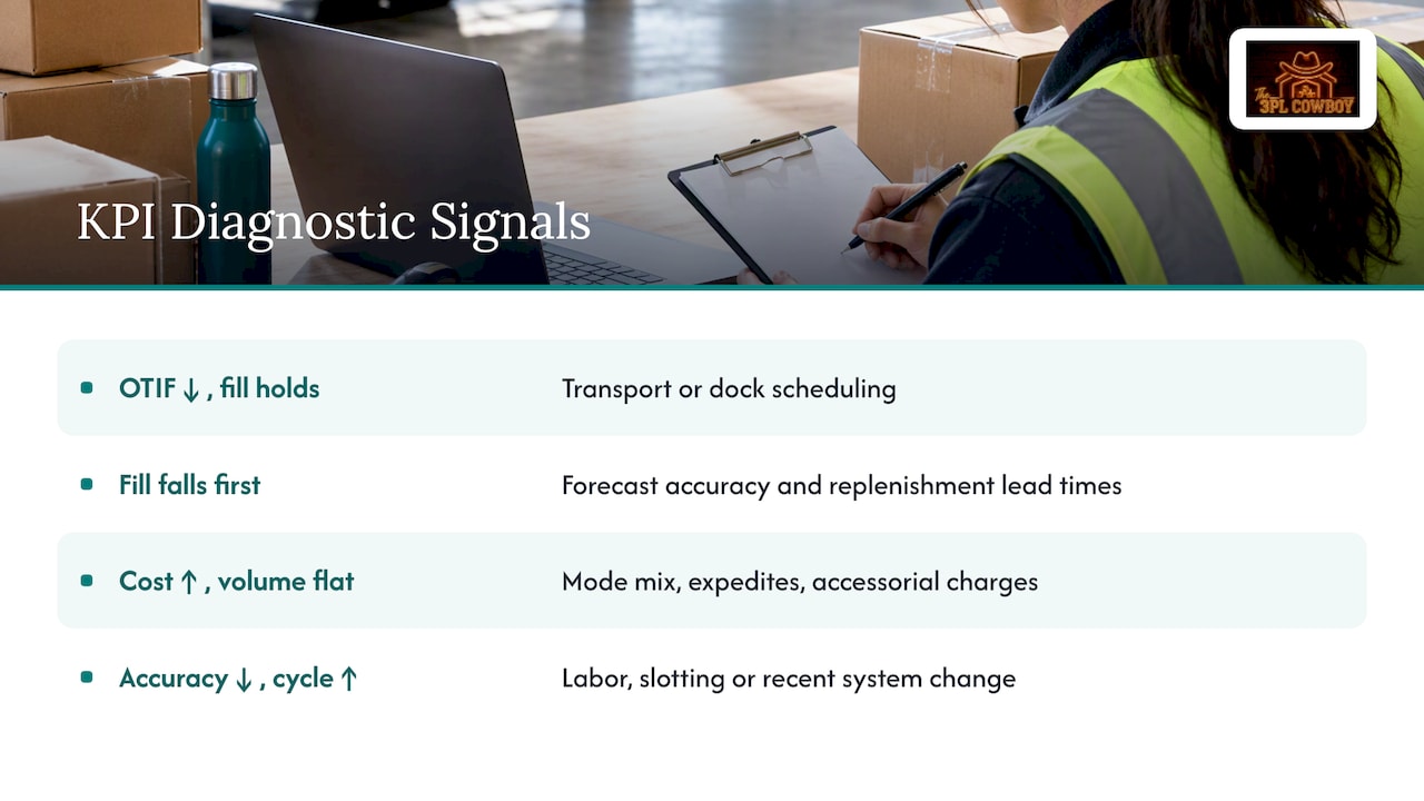
Look at direction and cause, not just level. A brief fluctuation may be noise; sustained drift is a signal. Always read KPIs in pairs so one explains the other.
If OTIF falls while fill rate holds, the problem is transport or dock scheduling, not inventory. If fill rate falls first, check forecast accuracy and replenishment lead times. When cost per shipment climbs but volume is flat, look at mode mix, expedites and accessorial charges before blaming carrier rates. If order accuracy slips alongside rising order cycle time, suspect labor, slotting or a recent system change.
Use drilldowns to isolate: by warehouse, carrier, lane, customer and SKU family. Most failures concentrate in a small slice, and the dashboard should make that slice obvious. Annotate the chart when something changes, such as a new carrier, a promotion or a WMS release, so the next reader does not guess.
Close the loop with a short written note for every sustained red KPI: what happened, the root cause, the fix, the owner and the date. That habit turns a dashboard into a management system. If OTIF is your weak spot, our OTIF improvement playbook covers the tactics that usually move it.
How do you get people to actually use the dashboard?
Adoption fails when the dashboard feels like surveillance or a reporting chore. Fix that by building it with the people who will use it. Sit with supervisors and planners, ask which decision they make at the start of the day, and build that view first.
Run the dashboard in the meetings that already exist. Replace the slide deck in the daily huddle and the weekly carrier review with the live view, so using it is the default and ignoring it costs time. Executives set the tone: if leadership asks questions from the dashboard, everyone checks it.
Train on interpretation, not on clicks. Show teams what a red KPI means and what action is expected. Keep the first release small, ship improvements regularly and retire metrics nobody uses. Name a dashboard owner who fields feedback and fixes errors quickly, because one wrong number that goes uncorrected will cost you months of trust.
Finally, tie the numbers to recognition and accountability. Celebrate a site that closes an OTIF gap, and require corrective-action notes when a KPI stays red. People use tools that make their work visible and fairer.
Where do predictive KPIs and advanced analytics fit?
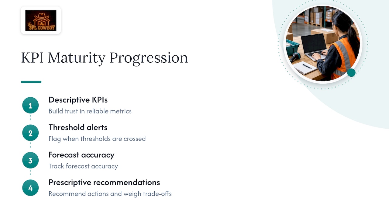
Once descriptive KPIs are trusted, add leading indicators: forecast accuracy, supplier lead-time variance, inventory at risk of stockout, carrier capacity risk and port or weather disruption flags. These tell you what is about to go wrong rather than what already did.
The bigger shift is from showing status to recommending action. MIT Sloan Management Review notes that the most advanced dashboards embed prescriptive models that weigh trade-offs, such as the cost of expedited transport against the cost of a stockout, rather than merely visualizing status. A dashboard that shows a stockout risk is useful; one that also shows the cheapest way to prevent it is better.
Keep humans in the loop. MIT’s research on S&OP for third-party logistics found that forecasting and dashboarding need continuous feedback from subject-matter experts, because automated models like SARIMA and Prophet cannot account for nuances such as customer churn or facility constraints. Review model errors regularly with the planners who know the business.
Work in this order: reliable descriptive KPIs, then alerts on thresholds, then forecast accuracy tracking, then prescriptive recommendations. Skipping steps produces impressive demos that nobody trusts.
How should you secure supply chain data in a dashboard?
Supply chain dashboards hold customer names, rates, volumes and supplier terms, so treat them as sensitive. Start with role-based access: carrier managers see lane performance, finance sees cost and rate detail, and external parties see only their own scorecards. Apply the principle of least privilege and review access quarterly.
Set governance rules around the data itself. Document who owns each source, which definitions are official and how changes are approved. Keep an audit trail of who changed a formula or target and when. Mask or aggregate customer-level data in broadly shared views.
If you share dashboards with 3PLs, carriers or suppliers, agree in writing on what each party can see, how long data is retained and who is accountable for a breach. Use single sign-on and multi-factor authentication where your platform supports it, and encrypt data in transit and at rest. Know where your BI vendor hosts data, and confirm that it meets your customers’ contractual requirements.
Finally, plan for failure: backups of the underlying data, a documented process for correcting bad data and a clear owner who can pull a dashboard offline if something is wrong.
What should you stop measuring, and what should you track instead?
Stop admiring averages and vanity totals. Total shipments, average transit time with no distribution and pick rate without accuracy all flatter the operation while hiding failures. Replace them with OTIF by customer, transit time variance, and accuracy-adjusted productivity. Track the delta and the rate of change, and attach an action to every red metric. If you take one action, pick the KPIs that drive your costliest decisions and review them with their owners.
— Michael Nooner
How does The 3PL Cowboy turn KPI dashboards into better 3PL decisions?
We are an operator-led brand advisor and supply chain advisor for brands and 3PL operators. Our 3PL Selection & Diligence, Fulfillment Cost Benchmarking and 3PL Operations Advisory work uses dashboards to verify provider claims, benchmark rates and keep RFPs honest. If you want a dashboard that drives real decisions, start on our services page.

FAQ
What does KPI stand for in logistics?
KPI stands for key performance indicator, a measurable value that shows how well a logistics process is meeting a goal. Each KPI should have a definition, a target, a data source and a reporting frequency.
What are some examples of KPIs used in supply chain management?
Common examples include on-time in-full (OTIF), fill rate, inventory turnover, order accuracy, order cycle time and cost per shipment. Carrier metrics such as on-time pickup and tender acceptance round out the set.
How do you monitor KPIs effectively?
Match the reporting cadence to the decision: shift or daily for service and exceptions, weekly for cost and inventory trends, monthly for strategic measures. Assign a named owner and an alert threshold to each KPI, and require a corrective-action note when one stays red.
How many KPIs should a supply chain dashboard have?
Fewer than most teams think. Start with a focused set tied to specific decisions, grouped into role-based panels, and drop any metric that no longer informs decisions.
Sources
Most dashboards fail on data, not design. Pull from the systems that already hold the truth: ERP for orders and financials, WMS for inventory and labor, TMS for freight, OMS and e-commerce platforms for demand, carrier APIs and EDI for tracking, and telematics or IoT for in-transit visibility. A practical dashboard centralizes ERP, WMS and TMS data so alerts and cross-functional views come from one place.
Order IDs, ASNs and shipment IDs must map cleanly across systems, and timestamps need a common time zone, or your lead-time math will be wrong. Order-intake data often lives in email attachments; AI in supply chain for leaders covers getting order data from inboxes into your ERP, which is where many cycle-time metrics start.
Apply these data-quality rules before you trust any number:
- SCOR Digital
- Unleashing the Potential of Supply Chain Analytics
- Developing a dynamic S&OP process for third-party logistics – SCM